Color Matching in the Printing Industry
The Short VersionThe Photo Shoot
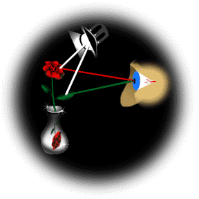
 At a photo shoot, you are perceiving reflected color in the full color spectrum. This reflected light is captured by the camera. Different digital cameras have different color characteristics.
For your printed piece you choose the photo that looks the best. You do not choose the one that most closely matches the actual photo shoot. The photos do not match the product at the photo shoot, and you no longer have the photo shoot set up in front of you to compare.
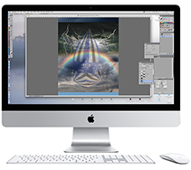
You may be choosing between multiple shots on your computer screen. You are perceiving projected additive color. Every computer screen is different. None of them can match the reflected light you saw at the photoshoot. You are making decisions based on reflective color, not absolute color.
Digitizing Reflective or Transparent Art
The precision with which digital camera can differentiate between shades of color is determined by the hardware and the format in which the digital information is saved.
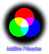
 At some point, you are looking at the digitized image on a computer screen. The monitor employs selective projection (red, green and blue (RGB) phosphors on the screen glow brightly or dimly). Monitors tend to be too bright and too blue. There are ways to calibrate a monitor to more accurately represent a printed piece.
Then the digital image is translated to cyan, magenta, yellow and black (CMYK) components. The conventional process color ink-on-paper color gamut is limited. You cannot reproduce every color that your eye can distinguish using CMYK inks on paper.
The Printed Proof
A proof is ink on paper. Light strikes the proof, is selectively absorbed by the inks, is reflected by the white paper under the inks, goes back through the inks and is selectively absorbed again. You perceive reflected light. The image is made with CMYK colorants. These are the primary subtractive reflected colors. (RGB are the primary additive transmitted colors of computer monitors). The colorants of a film transparency or an acrylic painting are different entirely. The digital proof cannot look like the image on the monitor, nor the transparency lying on a light table, nor the reflected light of the original photo shoot, nor the painting. You are now dealing with a severely compressed tonal range and colors that have been interpreted by the camera, by software, by the digital proofer, and by the paper on which the proof is made.


Printing
A printer will be able to very closely match a contract proof on press. It will not be an exact match, but it can be very close, especially when dealing with highly reflective, white, coated stocks, printing one image on one page at a time. But often 4 or eight pages are printed together on a large traditional offset press sheet, each with different images, different ink densities, and requiring different trade-offs for color.

This does not mean that you cannot get a good-looking finished product. It only means that, when it comes to photographs, scans, computer monitors, film proofs, and printed sheets, use the word "match" with extreme caution.
What is the Objective
"Matching" color is a goal rarely reached. But is the objective to "match" color? Match what? ... the original photo shoot? ... the computer screen? ... the digital proof? ... your idea of what it should be?The objective might more accurately be stated as:
To get a printed piece that looks great as a result of all your efforts and expenditures.
There are procedures you and your vendors can follow to get as close to that objective as possible. Be aware of what your pre-press and printing vendors can and should do. Be aware of what they cannot do. And ask beforehand if you are not sure.
 Thanks for visiting!
Forward comments or questions to info
Back to the Top of this Document
Back to the Color Matching Start Page
Over to the long dissertation on color
HTML, graphics and textual content © In Tandem Design, Inc. 1996.