
Color Matching in the Printing Industry
The Really Long-Winded Version, Techno Babble Included- Science and Perception
- An Example in Process Color
- Various Proofing Problems
- Computer Screens, Digital Proofs and Film Proofs
- Wrap Up
Science and Perception
"Color is Everything" ... That was a phrase used by a manager in an art department of a company in Kansas City called Hallmark Cards, Inc. A person such as that in a company that sells a billion dollars worth of decorated paper each year should know.
 What he also knew is that the conventional Process Color (Cyan Magenta Yellow Black, or CMYK) ink-on-paper color gamut is limited. You cannot reproduce every color that your eye can distinguish using CMYK inks on paper. This is not a matter of perception on the part of a computer operator; it is not a matter of attitude on the part of a printing press operator; it is not a matter of cost and time as presented by a sales representative. It is a matter of science.
You cannot "match" a proof on press (unless it is a press proof made on the same press ... and you probably still can't do it). This, too, is a matter of science.
You cannot "match" what is on the computer screen with a proof nor on press. Again, it is a matter of science.
The degree to which a computer monitor, a digital proof, a press proof, and a finished printed piece "match" is, to some extent, a matter of perception. It is also a matter of calibration and process control throughout the various operations in pre-press, at the supplier(s) to the pre-press house(s), at the paper manufacturer(s), at the ink manufacturer, and on press.
This does not mean that you can never get anything to look good. In fact, how good something looks is a matter of perception on the part of a computer operator; it is a matter of attitude on the part of a printing press operator; it is a matter of cost and time as presented by a sales representative.
No matter what kind of proof you deal with, it does not show you what you will get on press; if calibrated properly, it represents what you can get on press.
Consider photographing a silver vase of red roses on a white cloth.
Light strikes the red roses. All of the light except red light is absorbed. A great deal of the red light is absorbed, also. Some red light is reflected back, but it is disbursed by the uneven texture of the rose petals. Thus the roses appear deep red, and not like a point source of light.
Light strikes the green leaves. All of the light except the green is absorbed. A great deal of the green is absorbed, also. Some green light is reflected back, but it is disbursed by the uneven texture of the rose petals. Thus the leaves appear to be deep green, and not like a point source of light
Light strikes the silver vase. Very little of the light is absorbed; a great deal of it is reflected. It is not disbursed, because silver is specular, or mirror-like. Therefore, you see the spot light reflected in the silver vase. It may be distorted, since the silver vase is curved. However, the vase appears to be a point source of light. Light reflected from other objects in the room hits the vase and is reflected, also, so an image of the roses and of the leaves and of the camera is seen in the vase.
Click
Now all of this reflected light hits the CCD in the camera and creates color values in RGB for each pixel the camera can resolve.
Choose Your Shot
You lay the photos out on a computer screen and choose the one that looks the best. You do not choose the one that most closely matches the actual studio set up. The images you are looking at on your computer do not match the product at the photo shoot. The CCD of the camera records RGB - Not forest green or reddish maroon. Your computer screen projects RGB. Tincture of rose petal is not there. A combination of red light and blue light makes it look like a rose petal, but it's not the same red. It isn't. Really!
You are choosing the photo that looks best, not the photo that matches something. You are also making that decision based on relative color, not absolute color. The red rose will look red under slightly yellow or slightly blue light. The photo with the brightest red rose will appear to have the brightest red rose, regardless of the light. But if you had two computers side by side, the red you would see on one would differ from the red you would see on the other.
Pixel Bit Depth
Consider each pixel having 8 bits per color. In binary, there are 256 numbers available in an 8 bit word. The binary number 00000000 is zero; the binary number 11111111 is 255. Give an 8-bit word to each of red, green and blue and you get 24 bits per pixel ("24-bit color"). The total number of colors that can be created with 3 8-bit words is 256 X 256 X 256 = 16,777,216 (16.7 million colors).
Some cameras will record higher pixel bit depth, so that after color correcting or shadow enhancement or whatever other functions are being performed by the computer operator and its software, there is plenty of extra data from which a finished, 24-bit color can be defined for each pixel.
Some computer software uses CieLAB space rather than RGB, which allows for controlled transformation to other color spaces. CieLAB space defines hue in two dimensions and luminosity as a third.
Monitors tend to be too bright and too blue. There are ways to calibrate a monitor to more accurately represent a printed piece. Your computer workstation can be calibrated in order to provide a good soft proof (the image on the computer screen is referred to as a "soft proof"). Please, note the difference between a monitor that is calibrated to reproduce its reds, greens and blues according to its factory specification versus a monitor calibrated to look like print. The two are unrelated, although maintaining the former allows you to maintain the latter.
Without monitors calibrated to represented print, the only way to predict printed color at this point is by the numbers. A skilled image manipulator can read the CMYK values to which an area of the image will be translated, and know what that color will look like on press. Such an operator will know that there will be an overall cast of yellow or blue, or realize that the image is too dark or too bright. No matter how good the "soft proof" is, it helps to have a color expert who also knows what the numbers mean.
Now you have a computer file in CMYK, which has been projected by a computer screen calibrated to represent print by playing with how it selectively projects its red, green and blue light sources into your eye. The image you see looks good, how you remember the scene when the photo was taken. It does not match the original flowers in the original vase on the original white cloth. It cannot.
Down to the Bottom of this Document
There are color printers, there are really good color printers, there are digital proofers, there are really good digital proofers and there are digital presses (that was in order of the probability that they will accurately represent the finished printed piece, last being highest ... if that is the digital press that will print the final job). Let's assume that you are using a really good digital proofer that has been calibrated to closely match printed pieces.
A digital proof is ink or dye on paper. Light strikes the proof, is selectively absorbed by the ink or dyes, is reflected by the white paper under the ink or dye, goes back through the ink or dye and is selectively absorbed again, and lands in your eye. We are now dealing with reflected light, not transmitted light. We are dealing with CMYK, or the primary subtractive colors, not RGB, the additive transmissive colors of computer monitors. The digital proof cannot look like the image on the monitor. It cannot look like the reflected light of the original photo shoot. You are now dealing with a severely compressed tonal range and colors that have been interpreted by the camera, by the image manipulator, by the digital proofer, and by the paper on which the proof is made.
The digital proofers that use dye sublimation are causing dye to be absorbed into the surface of special paper. This is not ink-on-paper. Therefore it cannot match the ink-on-paper of a printing press. It can look similar to it, but not match it.
The digital proofers that use ink-jet technology put ink on paper. This may seem to be a step in the right direction, but the inks are far less viscous than offset litho inks, the dyes are not necessarily the same as those used by the ink manufacturer for your printer, and the patterns in which the inks are splattered onto the paper are not the same as the patterns of halftone dots or stochastic spots transferred to printing plates.
In most cases, the proofer cannot print on the same paper stock that you will use for the printed piece. Even if it can, the inks are different enough that they will perform differently.
The digital proof can give you a good representation of what a printer should be able to get on press, but it won't match. It can't. It can be very close, but it can't match.
The digital proof made from a calibrated system can allow you to make good, informed color decisions. That is how they should be used.
Go to Press
A printer will be able to very closely match a contract film proof on press at color OK. It will not be an exact match, but it can be very close, especially when dealing with highly reflective, white, cast-coated stocks, printing one image on one page at a time. But normally a traditional press prints 4 or eight pages at a time, each with different images, different ink densities, and requiring different trade-offs for color. Then as the run progresses, various conditions on press can cause color variation. So only a portion of the final print run will match the sheet from color OK. If you did get a digital press proof from the digital press that will print the job, you have the highest probability that the finished job will match the proof.
Down to the Bottom of this Document
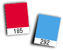
We are frequently asked why a CMYK proof doesn't reproduce Pantone Reflex Blue (or any number of other PMS® colors) faithfully. Well, it can't. We are also often asked to choose a color that more accurately represents a PMS color on our press. We can only do so by adding orange, violet, and/or green inks and using a 5, 6, or 7 color separation.
Few digital color printers can print spot colors; they all show CYMK builds of the spot color. If you have a Pantone Process Color Imaging Guide, it shows Pantone Match colors next to the best CMYK screen build they can come up with for it. Many CMYK screen builds are very different from the spot color they are to represent. The same results can be expected with any color printer.
Note: with some digital printers, including ours, you can get custom made matching inks. However, it is normally cost prohibitive for you and the printer unless you will be using the special color on many jobs.
For traditional lithography:
Down to the Bottom of this Document
Computer Screens
There are programs and devices that make a computer screen look more like a printed piece. Only a few programs will represent colors accurately in such calibrated environments, however. Photoshop® with a properly calibrated monitor can show you a close representation of how a photograph will print. Place that image in InDesign® and the computer screen no longer shows the color correctly. Make a box in Illustrator® and fill it with a color. Make a box in PowerPoint® and fill it with the same color and export it as a *.pdf. Place both in a page layout program in which you have made a box with the same color. No two will look alike.
The only way to see how all color elements in a project will look is to get a decent proof of the entire layout.
Digital Proofs
You might wish to get a digital proof early in a design cycle. Make sure that your proofing device, or that of your service bureau or printer is calibrated to accurately represent ink-on-paper from a printing press.
If your service bureau has an accurately calibrated digital proofer, you can make process color decisions based on it.
However, most digital proofs are not on the stock which will be used on press. They are often on unrealistically glossy paper, which looks nice but doesn't represent your project. If you get the digital proof to wow your boss, go for the glossy. If you get the proof to see what your project will look like, consider a less glossy stock. Many digital proofers allow for such a choice.
Also, a digital proof will normally not represent the dot gain you may experience on press with the stock you will use. Be aware that you should ask the service bureau to build dot gain into the proof, if you expect dot gain on press. Ask your printer how much is expected with the stock you've chosen. Even if you choose a sheet which is very bright and has good ink hold-out, a press operator will have more latitude on press if the files and/or plates have some dot gain built into them. We recommend 8% dot gain even with the best press and the highest quality sheet. You can always bring the ink up on press; problems arise when you can't bring the inks down.
Proofs do not represent what you will get on press; they represent what you can get on press.
You can also get results on press that do not look at all like the proof, nor the digital proof, nor the computer screen. There is a great deal that can be adjusted on a printing press to alter the color of a printed piece. There are many conditions associated with layout that can influence color on press. And there are conditions on press that vary over time, and, therefor, during the press run. The first sheet and the middle sheet and the last sheet might not match each other, let alone the proof. Sorry, it's true.
Down to the Bottom of this Document
What is the Objective
"Matching" color is a goal rarely reached. Paper used as the base for proofs is rarely the same as that used on press; even if the same paper is used, the colorants used for proofs might not be the same as the inks used on press (and inks from different manufacturers do not match each other on press); lighting conditions can cause perceived color shifts; some people are more sensitive to color differences than others.
But is the objective to "match" color? Match what? ... the original photo shoot? ... the computer screen? ... the digital proof? ... the film proof? ... your idea of what it should be?
The objective might more accurately be stated as:
To get a printed piece that looks great as a result of all your efforts and expenditures.
There are procedures you and your vendors can follow to get as close to that objective as possible. There are checks along the way that you should make to achieve it. There are things you can avoid which make the objective harder to reach. There are compromises you will have to make; so that the overall project is a success, even if certain aspects of it are not exactly the way you wanted them.
Be aware of what your pre-press and printing vendors can and should do. Be aware of what they cannot do. And ask beforehand if you are not sure.
Forward comments or questions to info
Back to the Top of this Document
Back to the Color Matching Start Page
Over to the short dissertation on color
HTML, graphics and textual content © In Tandem Design, Inc. 1996.
An Example in Process Color
Nothing Can Actually "Match"
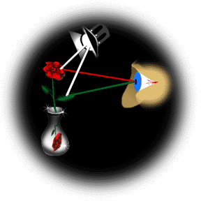 Light strikes the white cloth. Some of the light is absorbed; the rest is reflected. No particular color is absorbed more than any other; thus it appears white. The reflected light is dispursed by the uneven texture of the white cloth. Thus the cloth does not appear to be a point source of light.
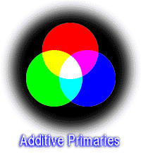 You are looking at an image on a computer. You are looking at transmitted light ... light that eminates from the screen, and shines in your eye. Your eye perceives Red, Green, and Blue (RGB) light, the additive primaries. Those are the colors transmitted by the computer screen.
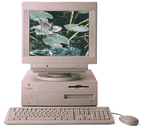 You are looking at the image on a computer screen. An old style compter monitor (CRT), the monitor is analogue (not limited to the 256 shades of an 8-bit word). The monitor projects light. It projects light in increasing or decreasing strength from little phosphors on the screen. This implies selective projection, not selective absorbsion that occurs with reflected light.
 The digital image is translated to CMYK, the Subtractive Primaries. This step should always be done by the best piece of gear and/or software in the production cycle. Photoshop® will translate from RGB to CMYK. Photoshop costs under a thousand dollars and does a lot more than just translate from RGB to CMYK. High-end scanner software costs many thousands of dollars. A good deal of what you pay for is the color transformation algorythms and tables.
Back to the Top of this Document
Let's print a digital proof.
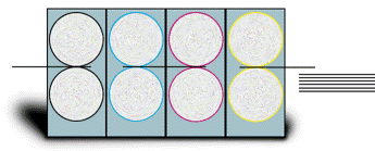
Back to the Top of this Document
Various Proofing Problems
 Problems with Proofs and Pantone®
Back to the Top of this Document
Computer Screens, Digital Proofs and Film Proofs
Is an image too light or too dark? Are the colors saturated enough or too much? Are the colors the right colors? Do colors chosen for non-photographic elements work together well? To answer such questions, you must be viewing a relatively accurate representation of what will happen on press.
 Computer screens tend to be too bright and too blue. They also can present a much broader gamut of color than can a CMYK printing press. Finally, they are projected light whose color depends on additive primaries: red, green and blue. A computer screen will never look exactly like the printed piece. It can't.
Back to the Top of this Document
Wrap Up
Just to reiterate: proofs do not represent what you will get on press; they represent what you can get on press.
 Thanks for visiting!